ABSTRACT WALLPAPERS
2024-
Using images I created myself as my personal wallpaper has always been a personal mark of pride. Growing up, I would frequently use my particularly scenic or interesting photos, but the older I get, the less I find myself caring about cosmetic aspects of the tech I use. If I'm going to leave my wallpaper unchanged for months on end, it should probably be something that's somehow both interesting and generic at the same time. I've started the habit of coming up with a unique theme for each year.
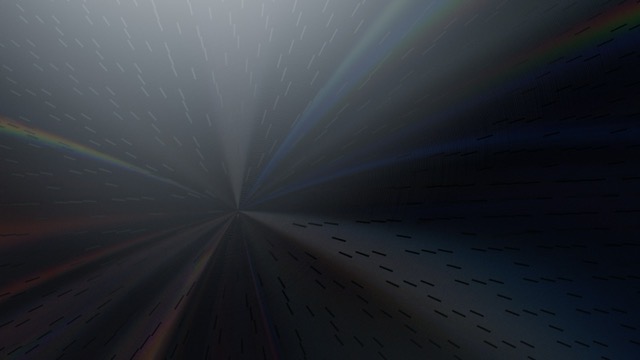
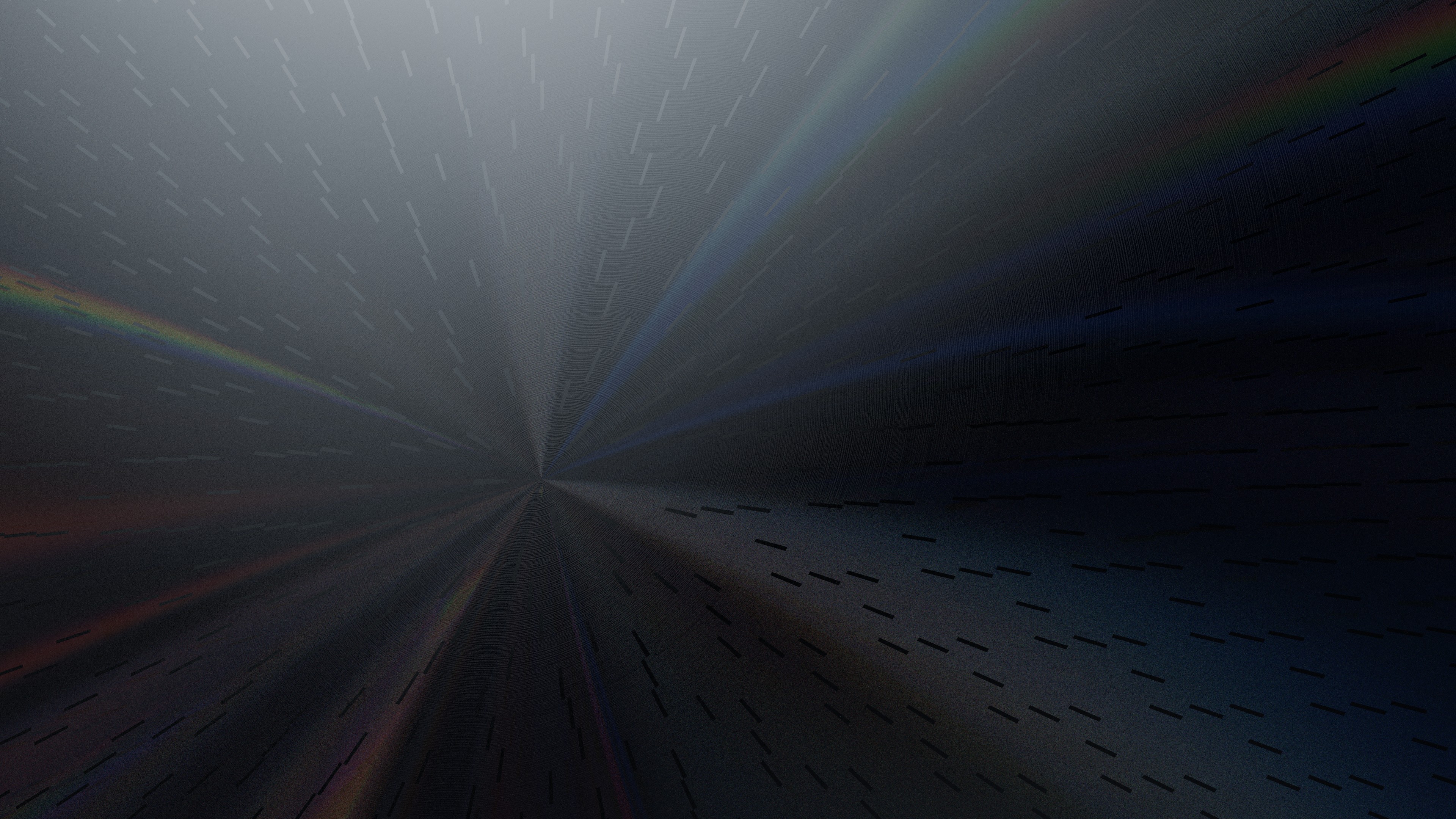
Wave (2024)
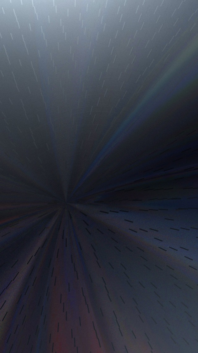
One of the earliest add-ons I obtained while learning Blender was Shaders Plus by SMOUSE. I was absolutely entranced by how its glass shader handled the complex optical phenomenon known as dispersion. In most real-world materials, the effective index of refraction (IOR) is slightly different for different wavelengths of light. This is how prisms and rainbows separate white light into spectra, where a diamond gets its "fire," and so on.
While fooling around with one of these dispersion shaders, I tried setting its default IOR to a ridiculous value that had absolutely no relation to real-world optics, and the result of that blew my mind. Everything behind that surface became wonderfully ethereal, as light itself seemingly got peeled away to infinity. Inspiration struck, and I laid out a scene with glowing filaments and inert blocks that would artfully obstruct the beams of light. I used Blender's compositor to replace the strict RGB channels with some blue/orange complementary colors to create the final image.
It looked fantastic on my computer desktop, but when I tried it out on my phone, it looked way too busy with the higher-density interface of iOS layered on top. So I rearranged the scene to concentrate the detail in the middle and leave the top and bottom relatively clean.
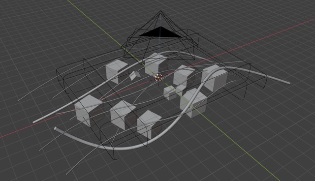
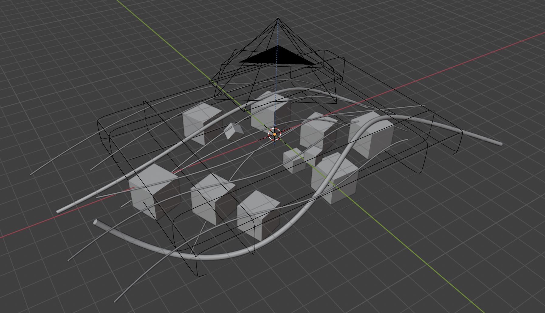
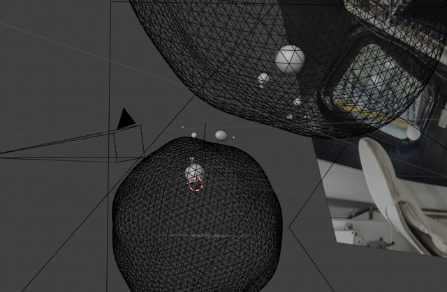
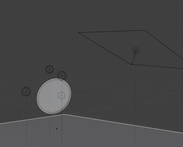
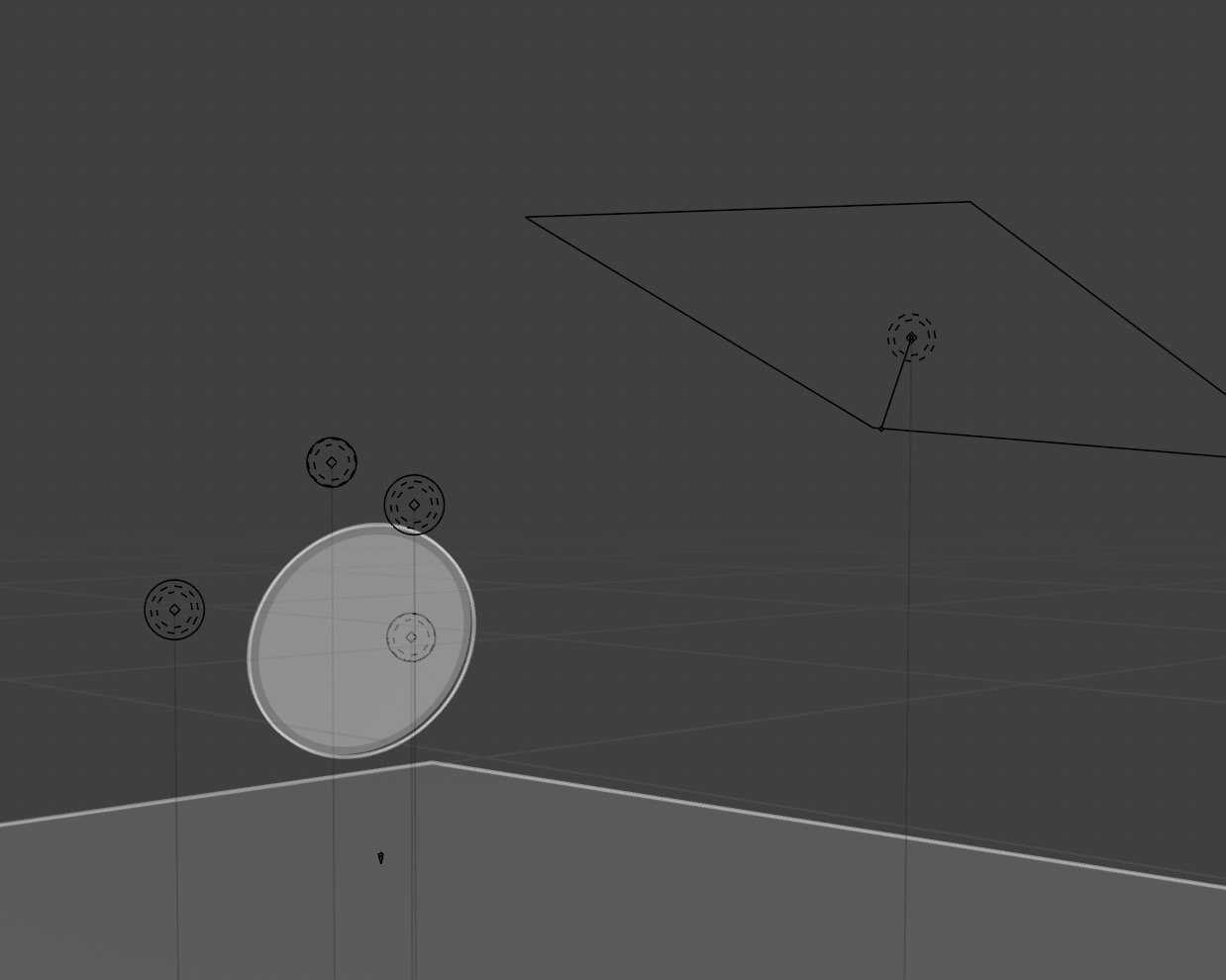
The scene before applying the impossible refraction effect.


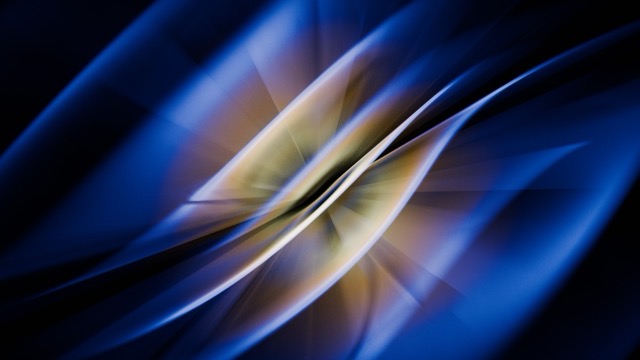

2024 - "Wave" - Landscape version
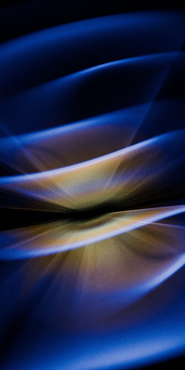
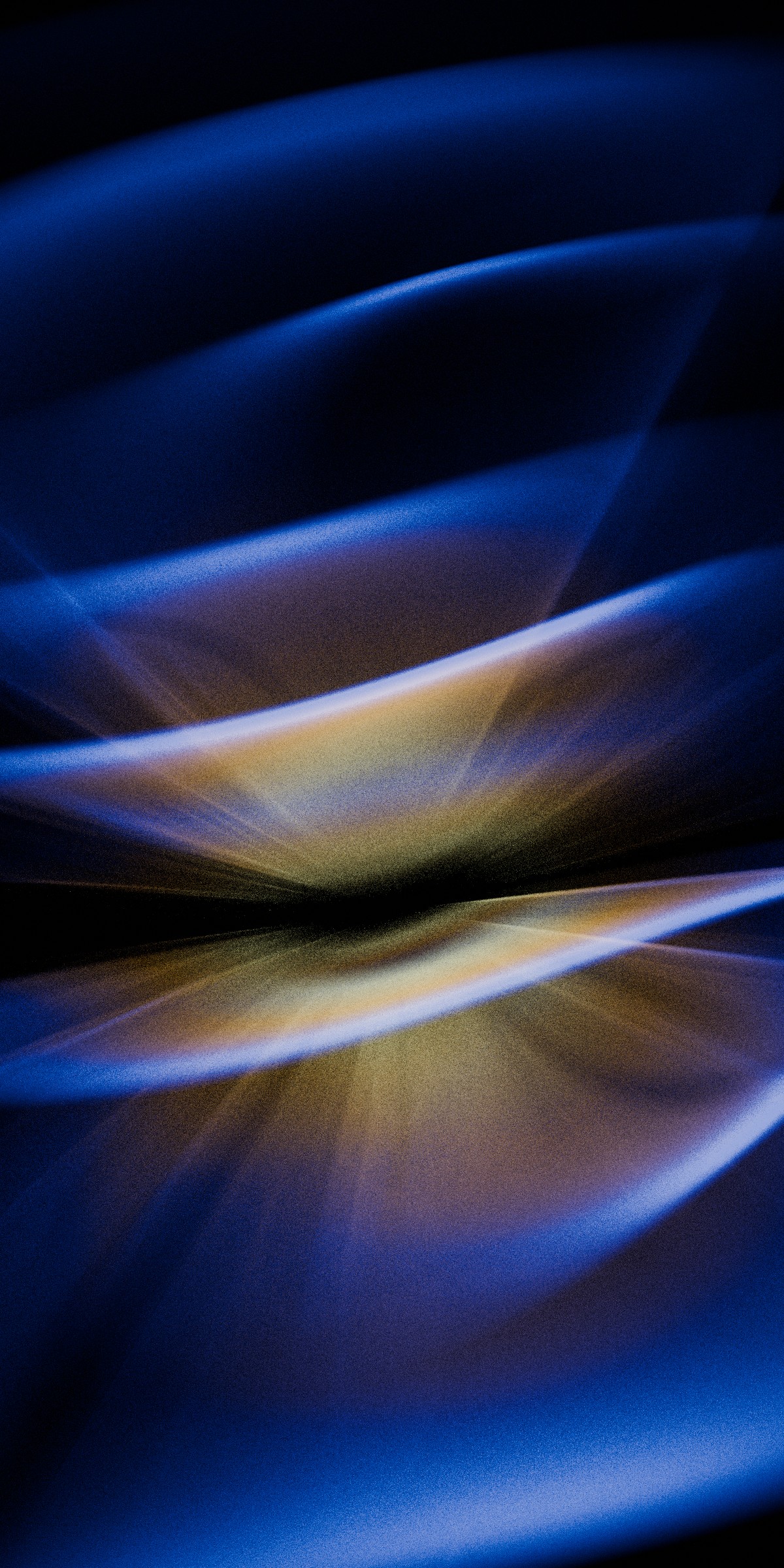
2024 - "Wave" - Portrait version
Float (2025)
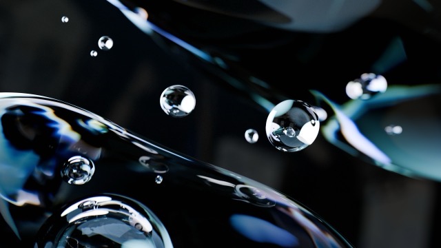
This year, I wanted to try something built around crisp edges and definite forms. I picked the theme of water droplets floating in space, and I still made heavy use of the dispersion effect but in a far less extreme and unrealistic manner. Artistically, the challenge with this one was in the handling of negative space. With light being both refracted through and reflected off the droplets and larger blobs, composing the scene was surprisingly difficult.
The light/dark contrast was a key part of the desktop version, but for the phone version, I didn't like the look of my darker app icons against the near-black center. I added a bunch of soft blue-green lighting to smooth out that contrast and again consolidate detail in the center.

The interesting technical challenge with this one was how air/water and water/air interfaces refract light differently.

2025 - "Float" - Landscape version
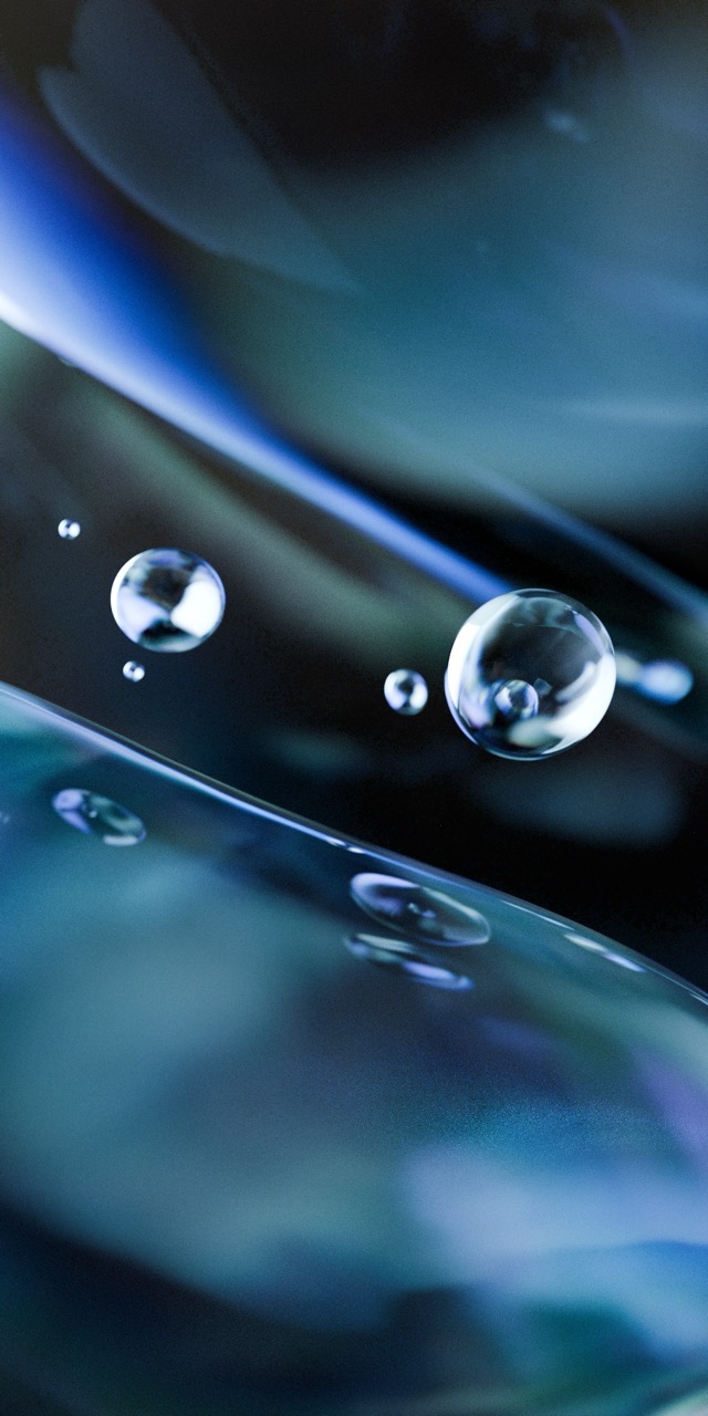

2025 - "Float" - Portrait version
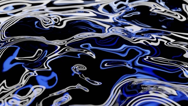
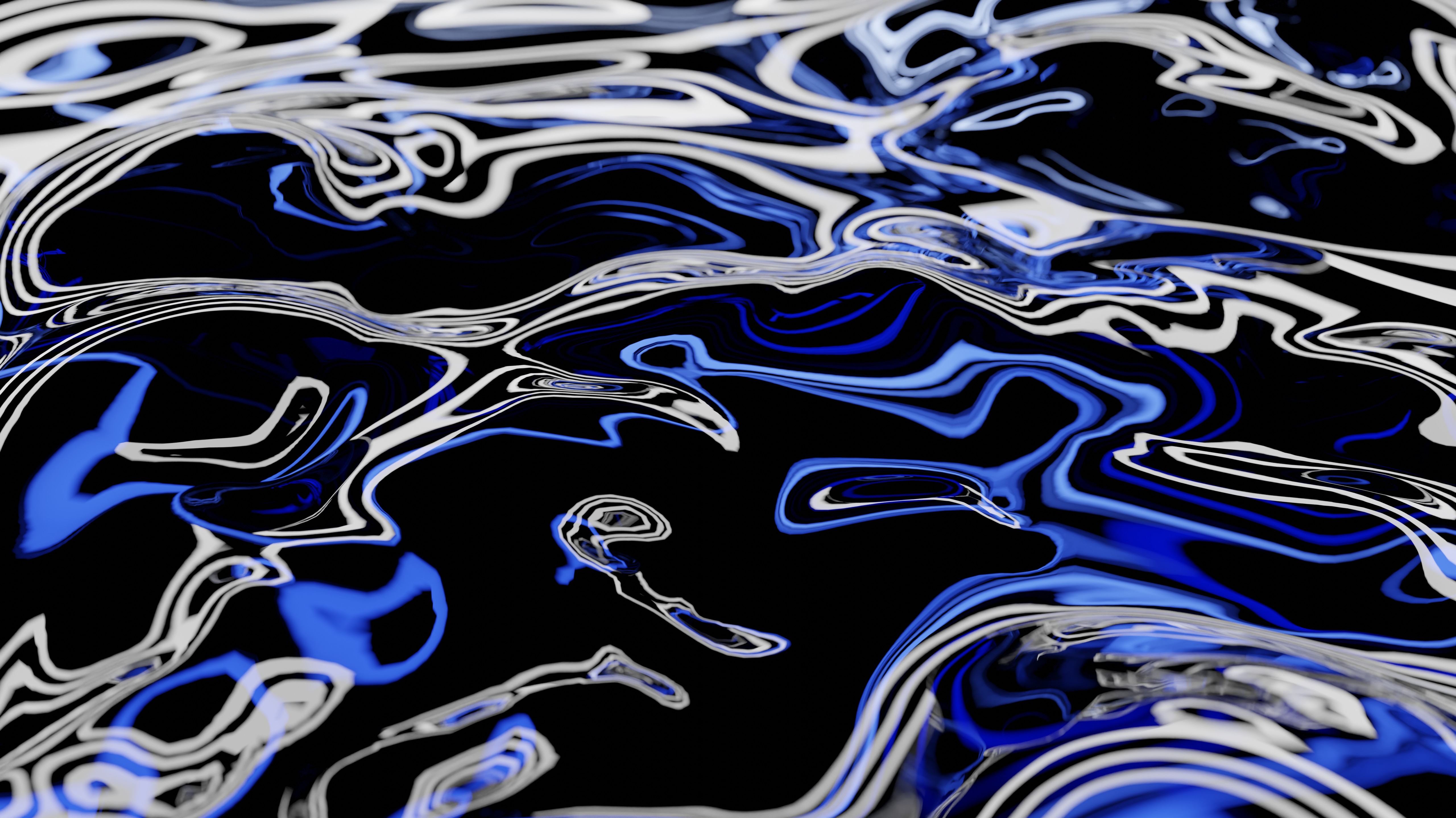
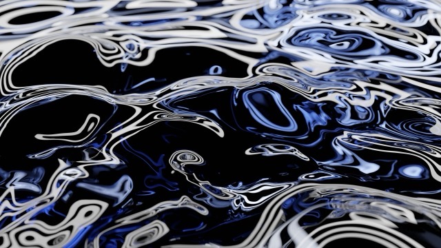
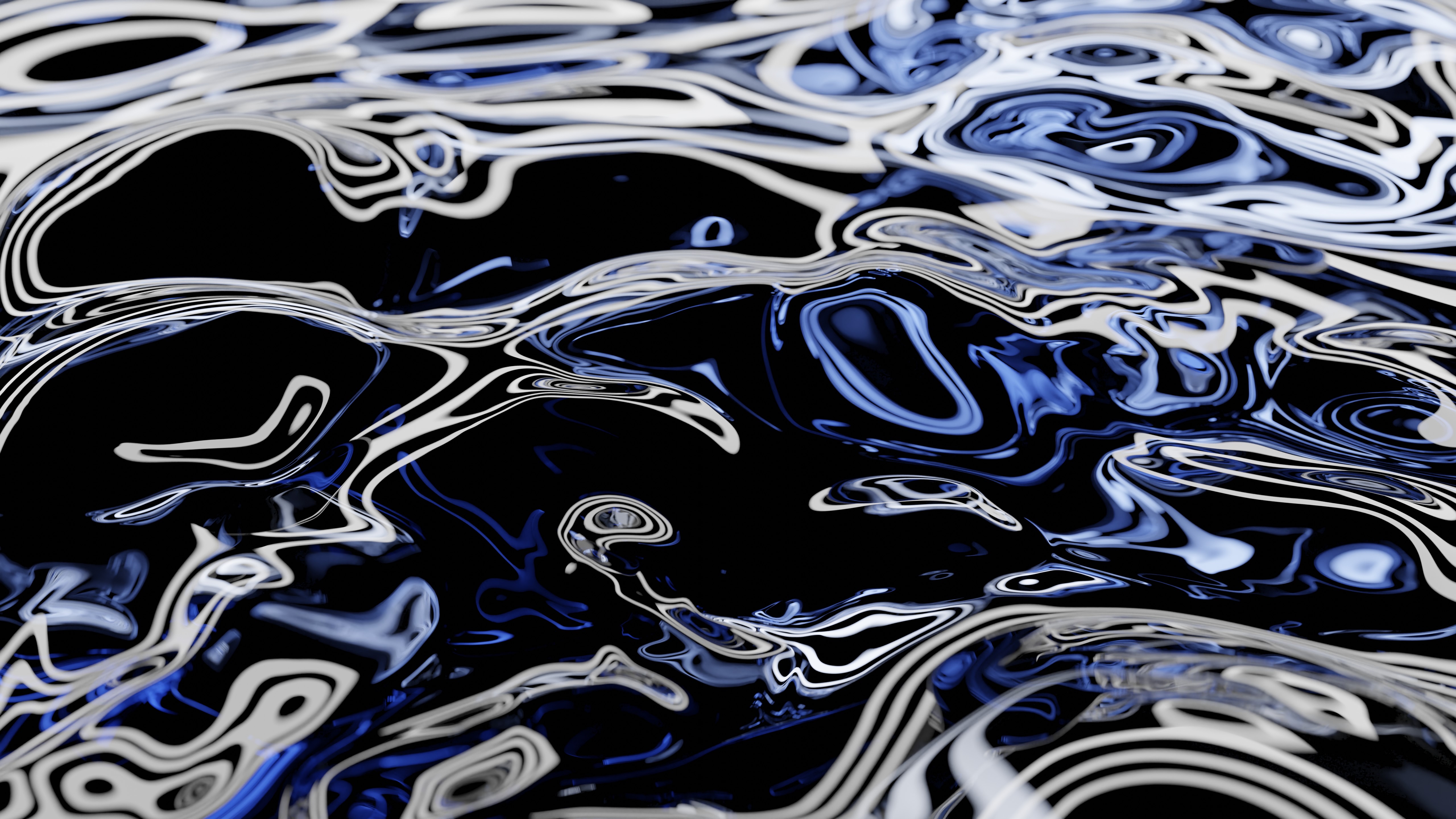
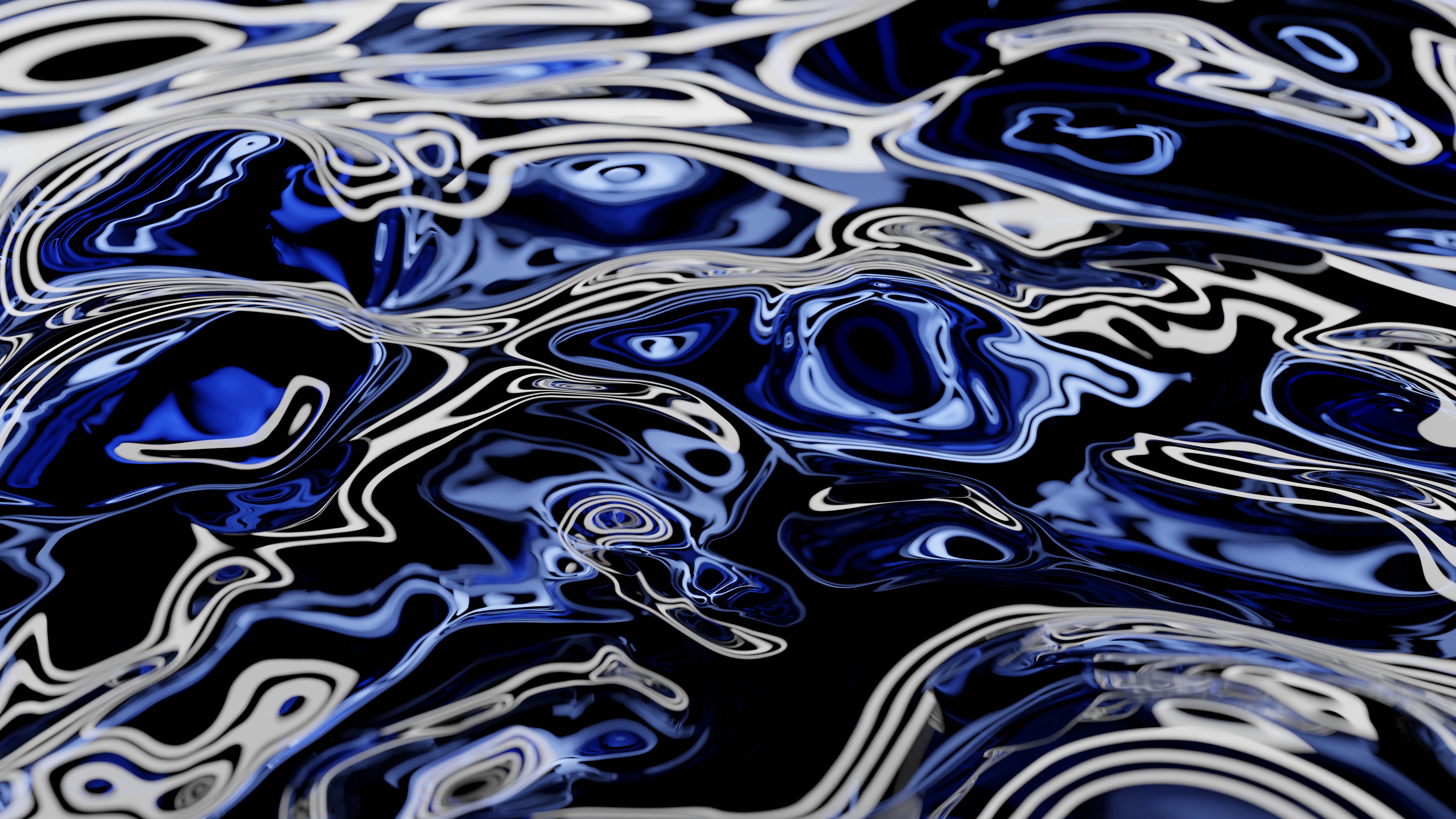
Disc (2026)
Late in the previous year, I finally figured out how to solve a technical challenge that had been plaguing me for months: an iridescent shader emulating the complex diffraction and constructive-interference behavior of optical data storage, that worked solely based on incoming light from the surroundings instead of having to "cheat." The breakthrough actually came from closely examining the dispersion setup in Shaders Plus to fully understand its stochastic sampling approach. I applied the same principle here, but with a far more complex interaction that affects not only color and refraction but also the direction of incident light.
This is the exact same material that I created for that prop, just separated from its surroundings and carefully lit to create a simple yet nuanced pattern of light. Ironically, this actually made the phone version uniquely difficult to produce this year. I wanted to tweak the lights to help keep my app icons from blending into the background, but I couldn't do that because moving the lights would have changed the pattern! I ended up just editing the render in Affinity, using a subtle gradient overlay to shade the image to my liking.
This was actually the simplest scene yet. All of the real complexity for this one was in the shader.
2026 - "Disc" - Landscape version

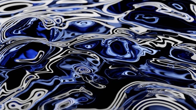
2026 - "Disc" - Portrait version
Check out the project for which I originally designed this effect:

Bonus: earlier attempts
Some of the results of fiddling around with simple glass refractions while I was first learning how to use Blender in summer 2023. I think these are way too visually busy to be good wallpaper, but at least they're kind of fun to look at.
Variation #1
Variation #2
Variation #3